
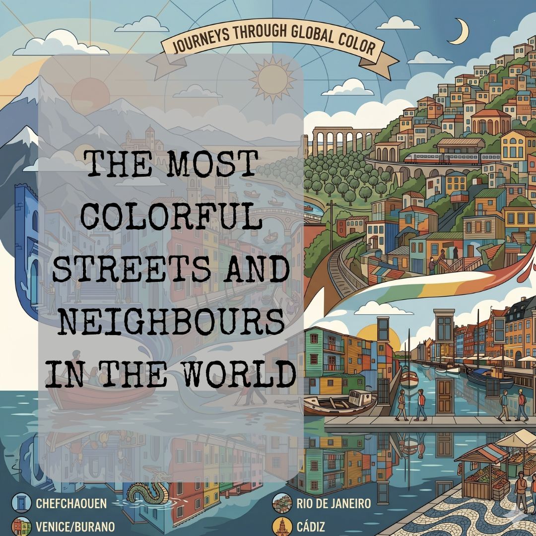
Painted Cities: The Most Colorful Streets and Neighborhoods in the World
Paint does something to a place that nothing else can quite replicate. Architecture defines the shape of a city. Landscaping defines its edges. But color — the deliberate choice to cover a surface in something bold, unexpected, joyful, or defiant — gives a place its soul. It is an act of identity as much as decoration.
In some corners of the world, this idea has been taken to its logical extreme. Entire neighborhoods, entire islands, and in some cases entire cities have been painted in ways that transform them from locations into experiences. These are not places where color was applied once and forgotten. They are places where the act of painting has become a tradition, a philosophy, or a quiet form of rebellion.
What follows is a journey through some of the most remarkable painted places on earth — and the stories behind the colors that define them. Because wherever there is a painted wall, there is almost always a reason it is that color. And the reason is almost always more interesting than the color itself.
Chefchaouen, Morocco — The City That Breathes in Blue
Tucked into the folds of the Rif Mountains in northern Morocco, Chefchaouen is a city that seems to exist in a slightly different dimension from everywhere else. Every surface that can be painted is painted — walls, steps, doorways, archways, alleyways — and almost all of them are some variation of blue. Powder blue, cobalt, aquamarine, indigo, slate, sky. It shifts throughout the day as the light moves, and in the evening, the entire medina glows as though lit from within.
The city was founded in 1471 as a military stronghold, and as travel magazine AFAR has documented, it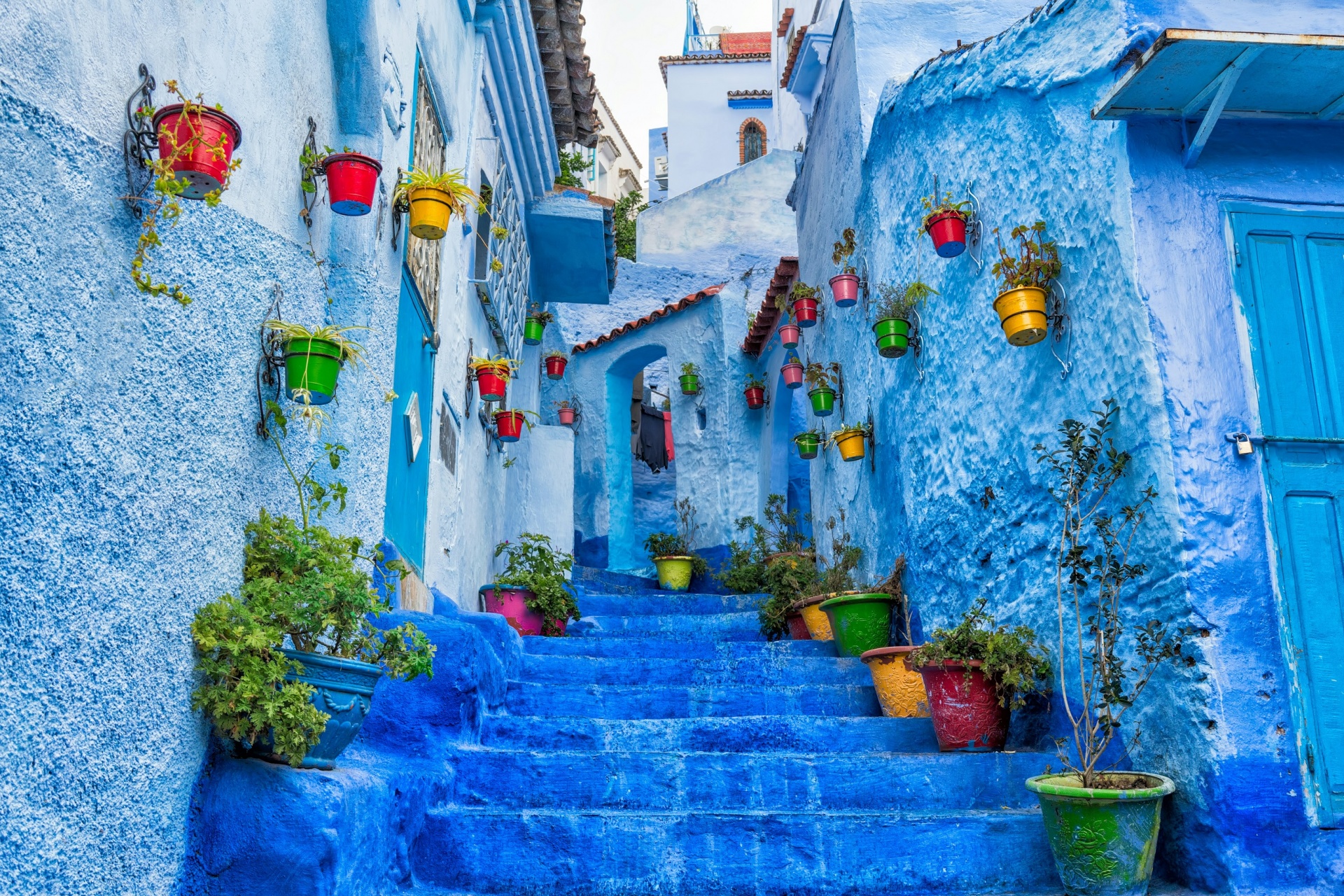 remained largely closed to outsiders for the better part of four centuries — a fact that preserved its character in remarkable ways. The blue, however, came later, and its exact origins are still debated with considerable passion.
One of the most widely cited stories — reported by AFAR and corroborated by several historians of Moroccan culture — connects the color to the Jewish community that arrived in Chefchaouen during the 1930s, fleeing the advancing shadow of fascism in Europe. In Jewish tradition, the color blue is associated with the sky, the divine, and a thread that ancient teaching said should be woven into prayer garments to remind the wearer of heaven. Painting one's home blue, the story goes, was an extension of this spiritual language — a way of living inside a reminder.
A different account, also documented by AFAR, attributes the blue to an earlier wave of Jewish and Moorish refugees who arrived from Andalusia in the late fifteenth century, following the fall of Granada. They brought with them a culture of whitewashed walls and shaded courtyards, and the blue may have evolved from that aesthetic over time, deepening and spreading across generations until it became what the city is today.
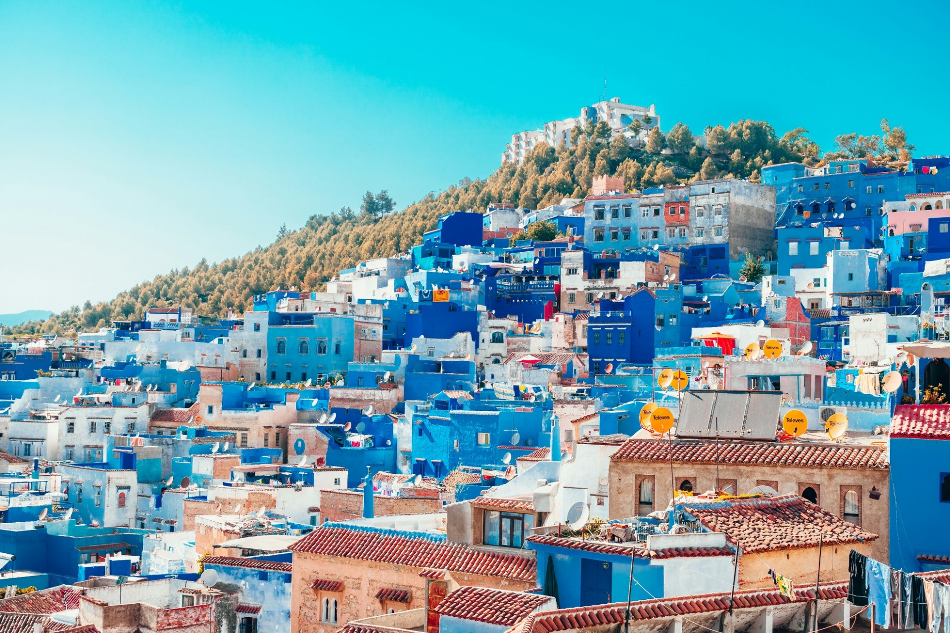 A more practical theory holds that the blue helps regulate temperature — that the particular pigments reflect heat more effectively than white plaster, keeping the narrow streets and stone buildings cooler in the fierce Moroccan summer. Travel writers and locals alike also mention a simpler explanation: that certain shades of blue repel mosquitoes. Whether or not the evidence fully supports this claim, it has been repeated long enough to become part of the city's mythology.
The truth is probably a confluence of all these things, layered over centuries of repetition until the color stopped being a choice and became a given. Every spring, the local government distributes paintbrushes to residents to help renew the city's signature look. Berbers, Muslims, and the descendants of those fifteenth-century Andalusian exiles all participate. The city repaints itself, year after year, not because it must, but because it would not be itself without the blue.
Burano, Italy — The Fisherman's Island and Its Strictly Regulated Rainbow
About forty-five minutes by water taxi from Venice, past the glass-blowing island of Murano and through thequieter reaches of the northern lagoon, lies Burano. It is small enough to walk across in half an hour, and from the water it appears like something a child might have drawn: a row of houses in vivid, saturated colors reflected in the still canal water below.
Red next to yellow next to green next to blue, then orange, then pink, then another red of an entirely different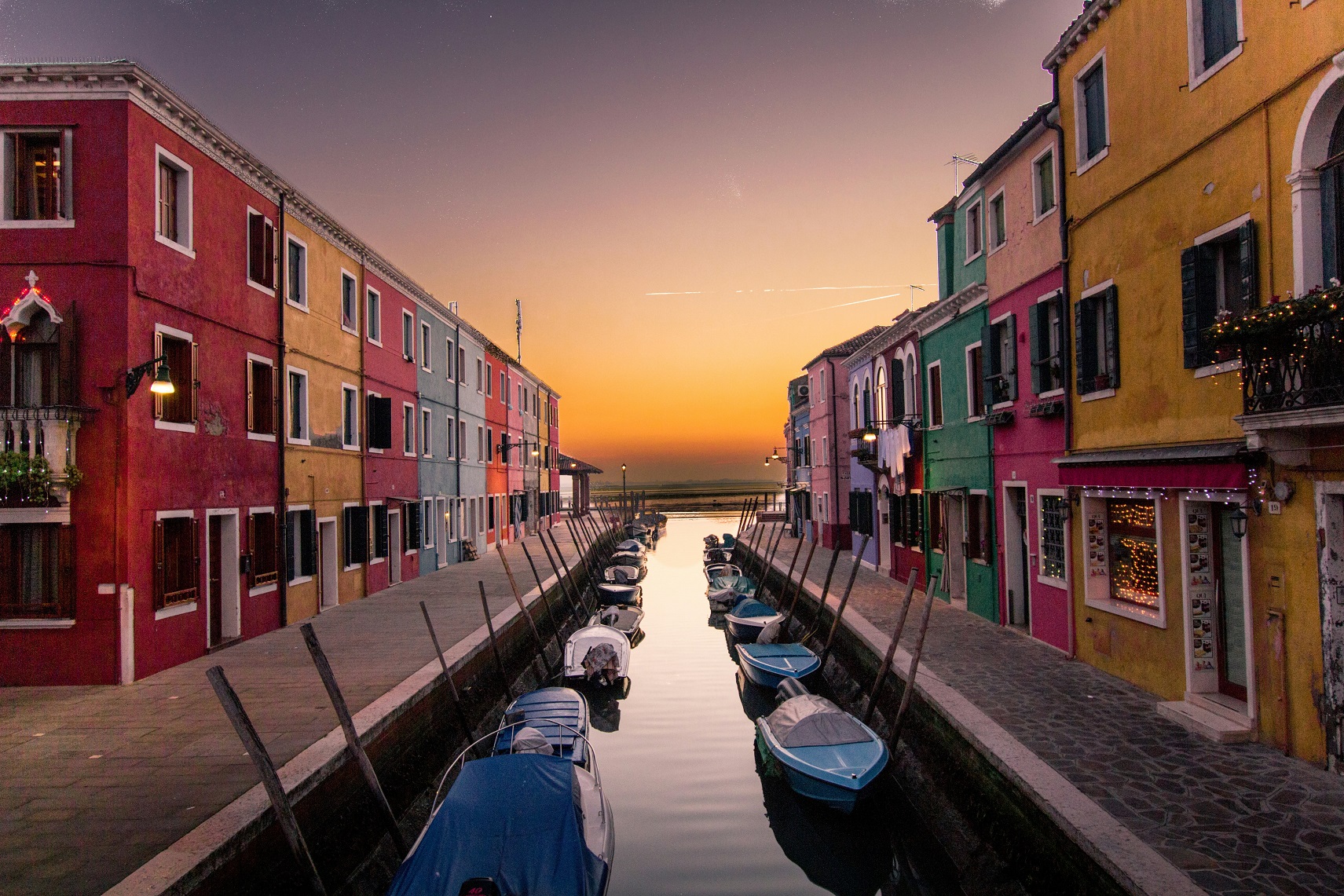 shade. No two adjacent houses are the same color. The effect is simultaneously chaotic and completely harmonious, as though someone with an extraordinary eye for contrast had been given unlimited paint and told to go to work.
The origin story most commonly told is both practical and poetic. As multiple travel and architectural sources note, Burano was a fishing community whose men spent long hours — and often entire nights — out on the lagoon in small boats. The island is notorious for its fog: a thick, disorienting blanket that rolls in from the Adriatic and turns the water and sky into a single grey indistinguishable mass. The houses were painted in bright colors so that the fishermen could spot their own home from the water even in the worst visibility. The color was not decoration. It was navigation.
Today, as architectural and design publication Rethinking the Future has noted, the tradition is maintained through a system that is probably the most bureaucratically rigorous approach to aesthetics anywhere in the world. If you own a house on Burano and wish to repaint it, you must formally apply to the government. Officials will consult a document that records every house and its officially designated color — and they will tell you what you are permitted to use. You do not negotiate. You do not improvise. You paint accordingly.
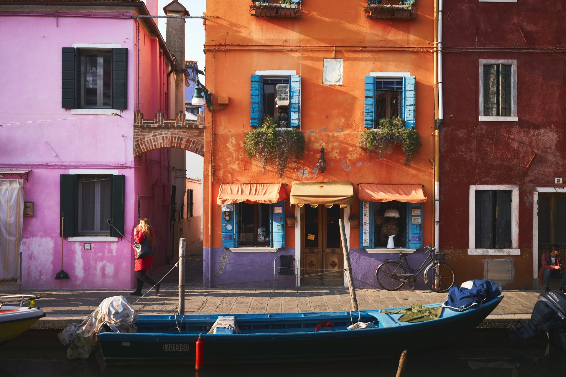 This sounds restrictive until you stand in front of the result and understand that the system is the artwork. The particular genius of Burano's streets is not any individual house — it is the sequence. The way the colors relate to each other, the way the whole street reads as a composition. And that composition has been curated over generations, refined by a system that treats the island's appearance as something too important to leave entirely to individual whim.
The women of Burano are also famous for their lace-making — an extraordinarily delicate craft practiced on the island for centuries. There is something that feels very Burano about that combination: the bold exterior and the intricate interior, the riot of color on the outside and the patience of the needlework within.
Bo-Kaap, Cape Town, South Africa — Color as an Act of Freedom
On the lower slopes of Signal Hill, within walking distance of Cape Town's city centre, Bo-Kaap is a neighborhood that can stop you in your tracks. The houses are painted in shades that would seem extravagant anywhere else — fuchsia, lime green, cobalt, tangerine, turquoise — and the cobblestone streets between them have a particular hush, a self-contained quiet that feels at odds with the noise of the city just below.
The history of Bo-Kaap is one of the most charged in South Africa. As documented by travel publication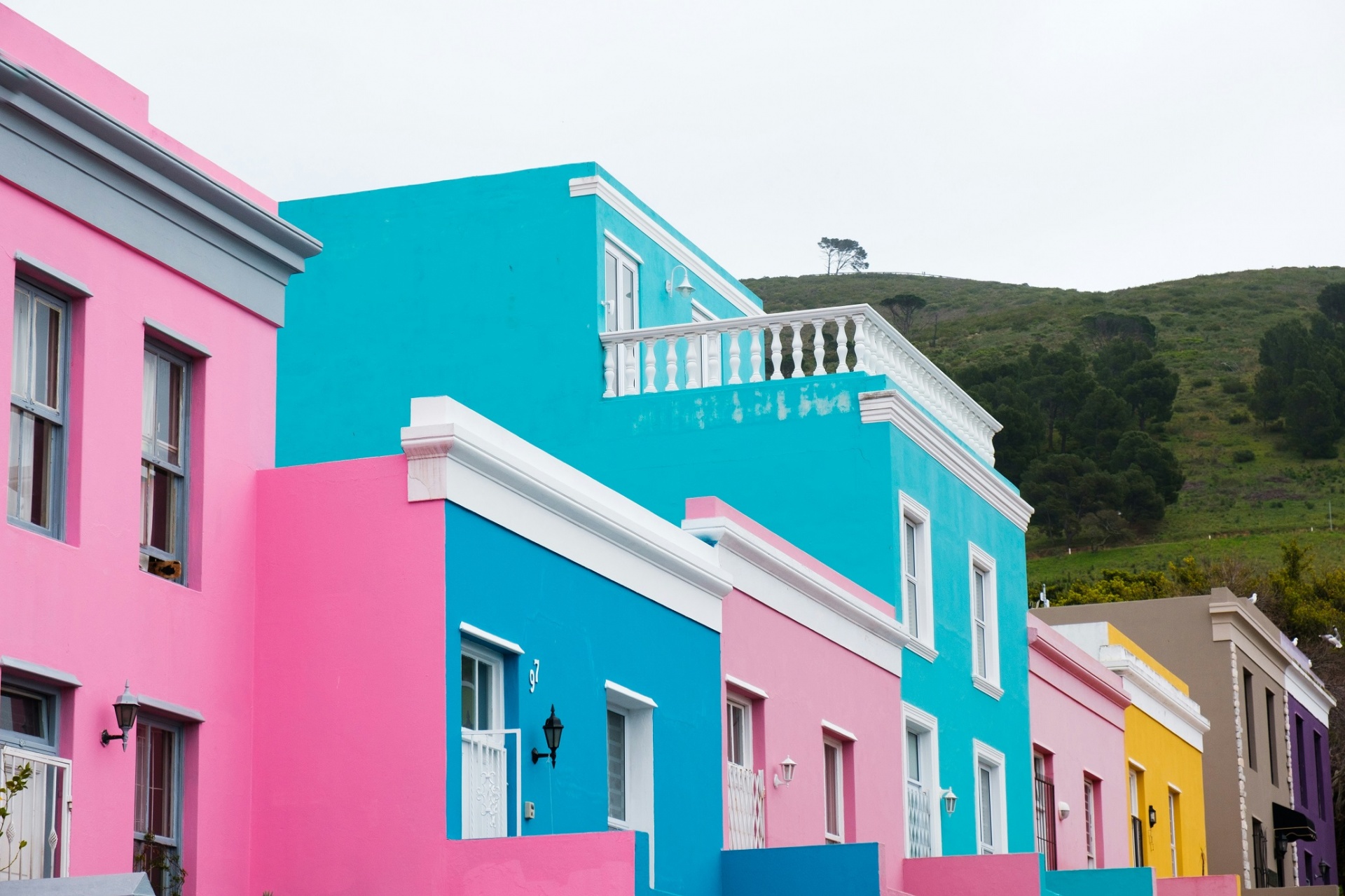 NonstopEscape and confirmed by historical records, the area was established in the 1760s, when houses were constructed and rented to enslaved people brought primarily from Indonesia, Malaysia, and other parts of Africa and the Indian Ocean region. These enslaved residents were known collectively as the Cape Malays — a term that encompasses considerable cultural, religious, and linguistic diversity, but reflects the deliberate flattening that colonial administration applied to the people under its control.
During the years of slavery, the houses of Bo-Kaap were required to be white. This was not an aesthetic choice. White was the color of control — uniform, visible, legible to authority. The houses were not the property of the people who lived in them, and neither were the colors on their walls.
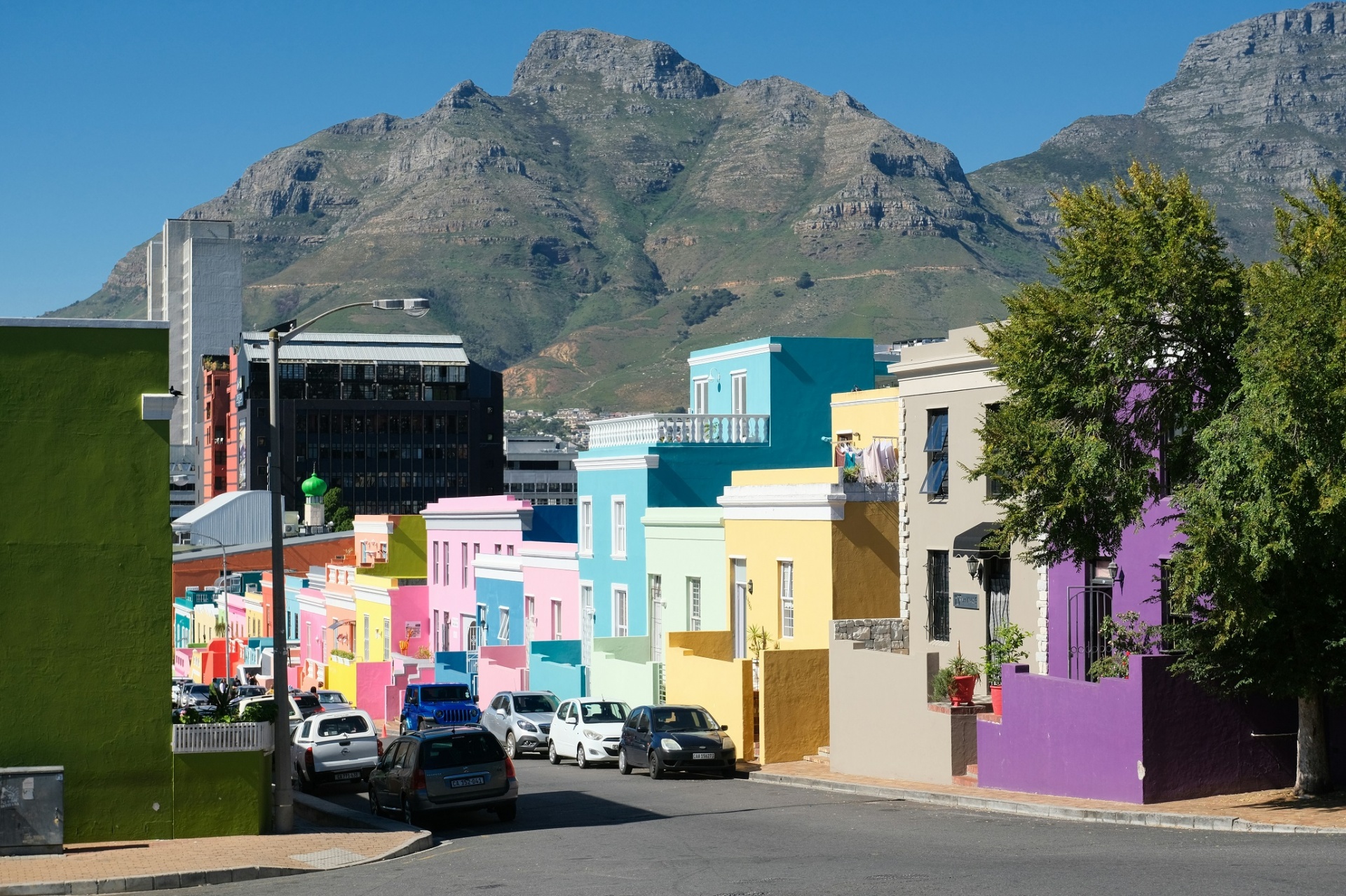 When slavery was abolished in 1834 and residents were eventually able to purchase their homes, the response was immediate and unmistakable. They painted. Bright, vivid, deliberate color — the most visible possible expression of the freedom that had been denied them. As TravelAwaits has noted, looking at the neighborhood today, the vivid houses are not merely cheerful or photogenic: they tell a deeper story. Every painted front door and lime-green wall is, in some sense, a political statement made in the language of color — a declaration that has been repainted, generation after generation, ever since.
The neighborhood today is home to one of the oldest mosques in South Africa and remains a deeply connected community. It is also one of the most photographed places in the country, which brings the complicated question of tourism into a neighborhood whose identity is inseparable from struggle. But the colors endure, still carrying the meaning with which they were first applied.
Valparaíso, Chile — The Open-Air Museum on the Hills
Valparaíso is a city built vertically. The flat lower town, el plan, clusters around the port with its warehouses and administrative buildings, and then the city rises sharply into a series of steep hills — cerros — each one dense with houses, stairways, and the network of funicular railroads that have been hauling residents up and down since the nineteenth century. As travel writers who have documented the city note, the oldest of these funiculars, Ascensor Concepción, has been in operation since 1883.
It is on these hills that Valparaíso has become something remarkable. Over the past few decades, the city has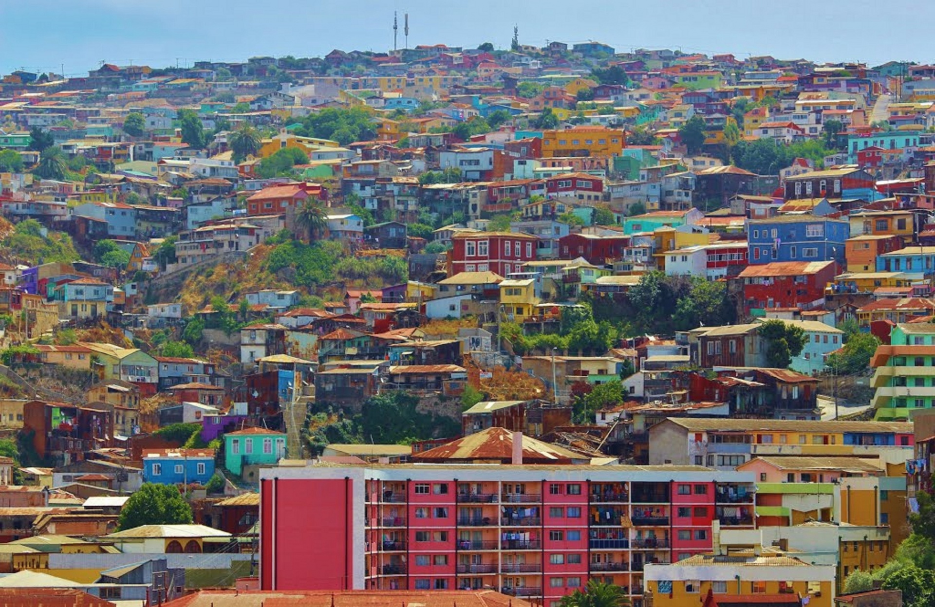 transformed itself into what is effectively the largest open-air art gallery in South America. The walls are covered in murals — not the territorial tagging that other cities try to suppress, but serious, ambitious, technically accomplished works of art by local and international painters. Houses are painted in reds and oranges and purples and greens. Staircases become mosaics. Doorways become frames for smaller compositions.
The city was declared a UNESCO World Heritage Site in 2003 for its distinctive urban landscape, and the street art culture has grown alongside that recognition. Local artists like Un Kolor Distinto — a duo whose work has been documented extensively by writers covering the South American street art scene — have produced murals that fill the entire walls of buildings several stories high, incorporating the mythology and political history of Chile into their imagery.
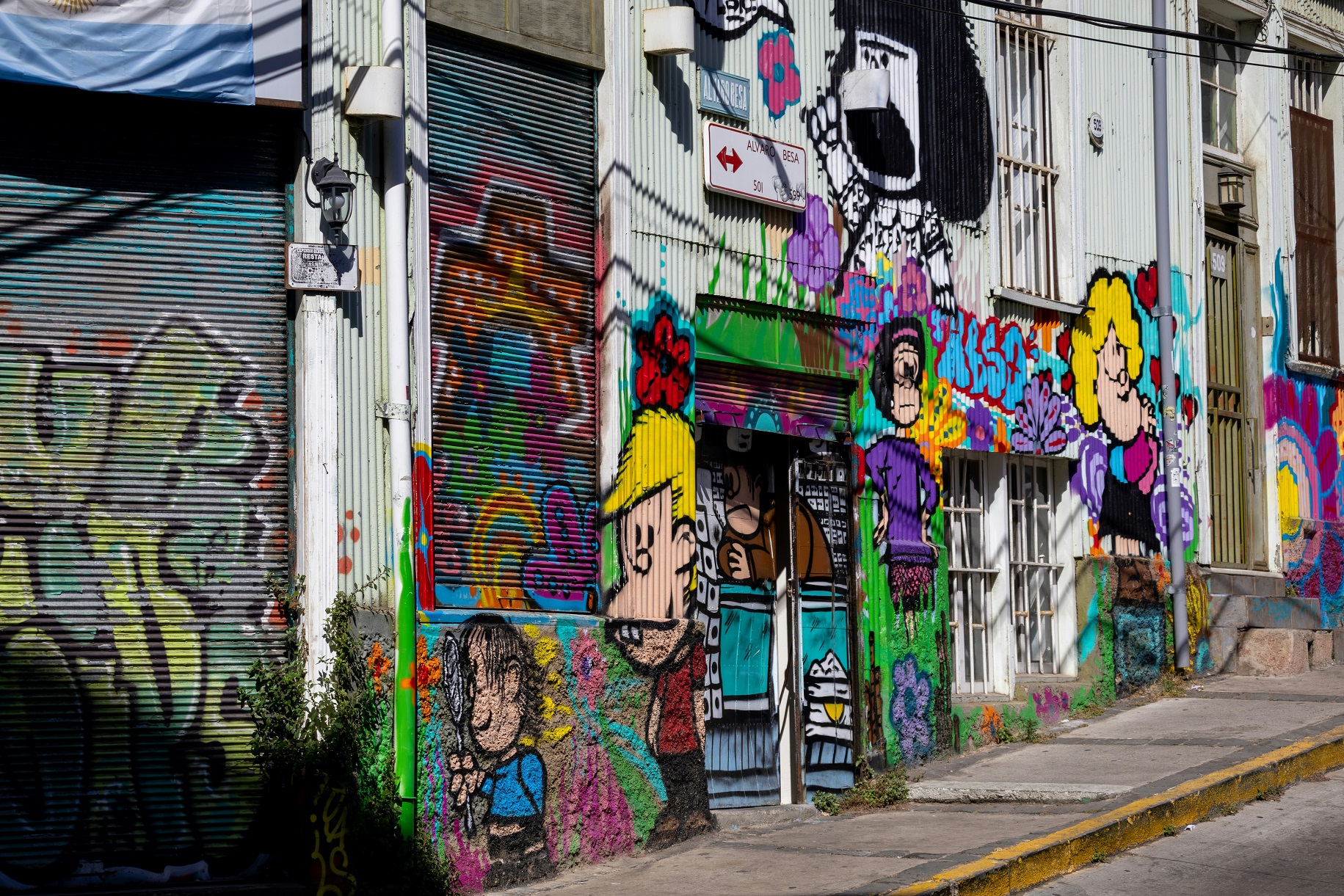 There is something defiant about Valparaíso's color too. The city has faced fires, earthquakes, economic decline, and the upheaval of Chile's political history in the twentieth century. The murals address all of this — social struggle, environmental grief, political memory — but in a visual vocabulary that refuses to be grey. The hills of Valparaíso insist on color even when the content of the art is difficult. Perhaps especially then.
Pablo Neruda, Chile's most celebrated poet, lived for years in a house on the hills of Valparaíso called La Sebastiana — a whimsical, vertiginous building that is now a museum and one of the city's most visited sites. The poet understood the city's particular magic, describing Valparaíso as absurd, crazy, colorful, and endlessly alive. That description holds today, perhaps more than ever.
La Boca, Buenos Aires, Argentina — The Colors Born from Scarcity
La Boca, which means 'the mouth' in Spanish, sits at the mouth of the Riachuelo river in the south of Buenos Aires. It was the city's original port — the entry point for generations of immigrants who arrived primarily from Italy at the end of the nineteenth century and into the twentieth, drawn by the promise of work in the shipyards and docks.
The story of La Boca's colors is one of the more unexpectedly beautiful origin stories in urban history. As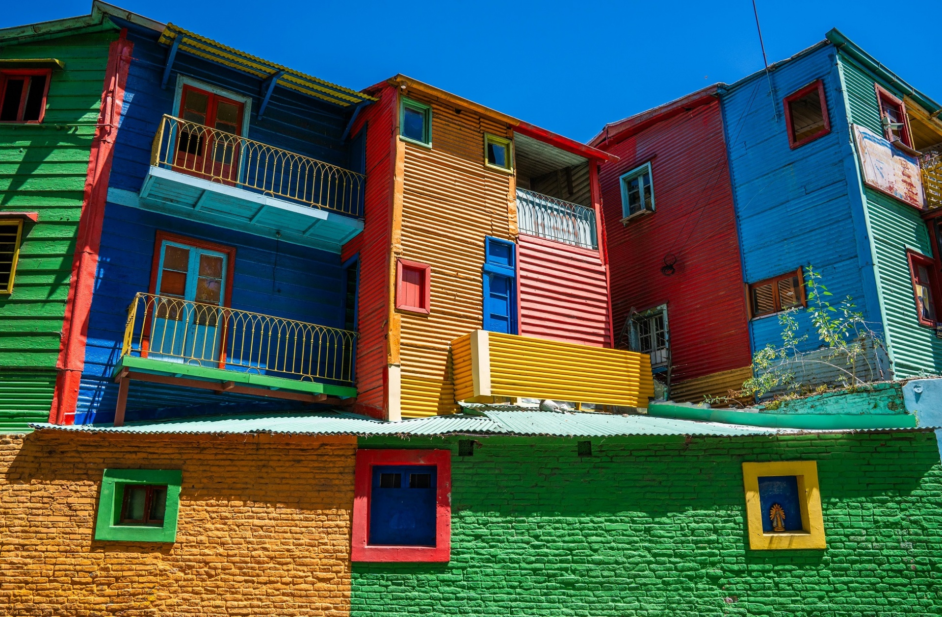 Amusing Planet has documented, the dock workers who built their lives here were poor, constructing their homes from whatever salvage materials they could find at the shipyard: scraps of timber, corrugated metal sheeting, remnants of ship hulls. When it came time to paint these improvised structures, they used the only paint readily available — the leftover stock from the boats being built and repaired around them.
Boat paint came in whatever colors the shipyard happened to have in surplus. There was rarely enough of any single color to cover an entire house. So the houses became patchwork — a wall of red, a door of yellow, a window frame of green, a second storey of blue — not by design, but by practical necessity. The color was not chosen. It accumulated, shipyard visit by shipyard visit, until the whole street looked like something deliberately planned.
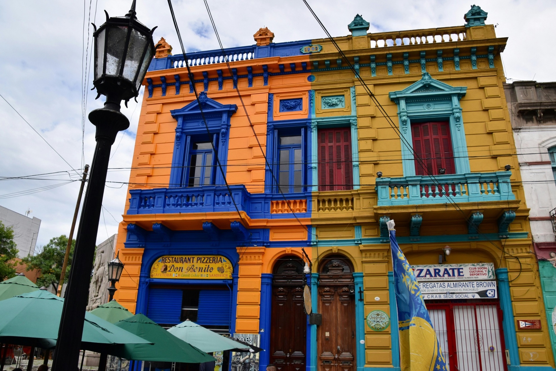 The artist Benito Quinquela Martín, born in La Boca in 1890, is credited with formalizing this aesthetic. As the official Buenos Aires tourism records note, Quinquela Martín began painting the neighborhood's buildings in vivid colors and established the Caminito — a short pedestrian street that became the neighborhood's heart — as an outdoor gallery. Over decades, he elevated La Boca's working-class origins into a distinctive artistic identity that has endured ever since.
La Boca is also the birthplace of the tango. The music grew from the meeting of Italian, African, and Spanish cultures in these very streets — from the instruments the immigrants brought with them, and the longing they felt for places they would never return to. In retrospect, it seems almost inevitable that tango should have been born here: in a neighborhood made of salvaged materials and borrowed colors, among people who had crossed an ocean and were making something new from what remained.
Nyhavn, Copenhagen, Denmark — Sailors, Stories, and Painted Terraces
Nyhavn — 'New Harbour' — was constructed in the seventeenth century as a working waterway into the heart of Copenhagen, and for most of its history it was not particularly picturesque. It was a port neighborhood: busy,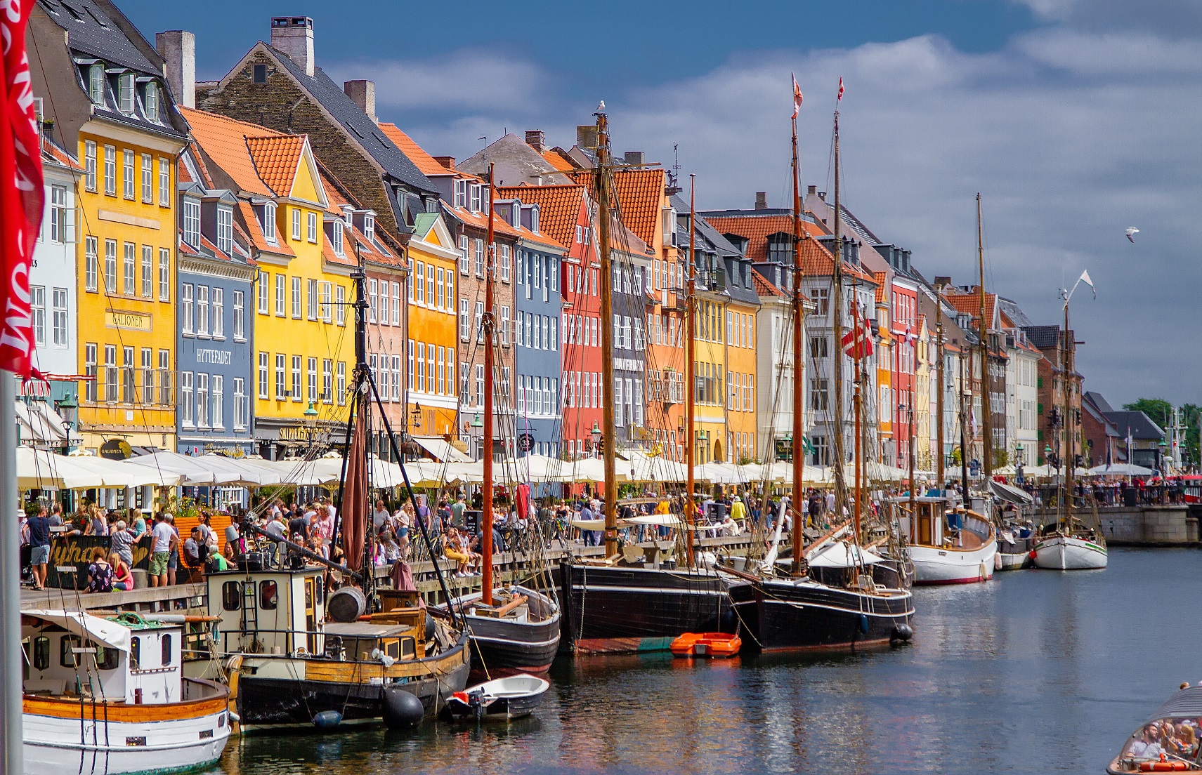 loud, functional, and home to the kinds of establishments that tend to cluster near working ports. Hans Christian Andersen lived at three different addresses on the canal during his lifetime, none of which, it should be said, seemed to improve his cheerfulness much.
The transformation of Nyhavn into one of Europe's most photographed urban scenes was gradual rather than planned. As design writers have noted, the canal was pedestrianized in 1980, and the neighborhood's character began shifting from functional to celebratory. The tall, narrow townhouses along the water — painted in ochre, terracotta, red, and blue — became the backdrop for outdoor cafes and restaurants that spill onto the cobblestones in summer.
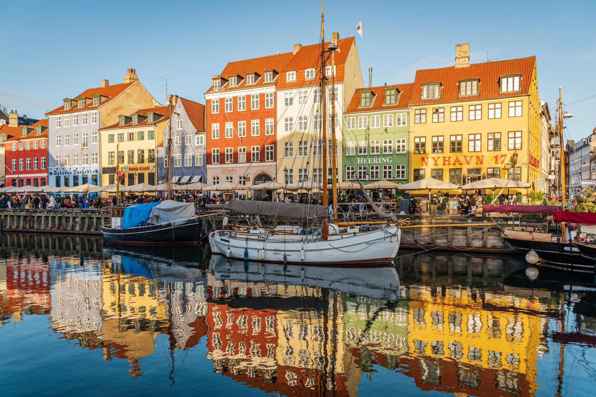 What makes Nyhavn visually distinctive is the relationship between the buildings and their reflection in the canal water. On a clear day, the painted facades double themselves in the still surface below, creating a composition that seems almost too perfectly arranged to be real. The colors were not chosen for this effect — they are the result of centuries of individual decisions by individual owners — but the outcome is one of those happy accidents of urban history that could not have been designed.
In winter, when the cafes close and the crowds thin, Nyhavn takes on a different quality — still beautiful, but quieter and more austere, the colors darker in the low Nordic light. It is one of those places that the seasons transform rather than simply interrupt.
What All These Places Have in Common
It is easy to look at Burano and Chefchaouen and Bo-Kaap as simply 'colorful places' — destinations that make for striking photographs and memorable travel experiences. But the more carefully you look at each of them, the more you notice that the color is never arbitrary. In every case, paint has been used to express something: identity, freedom, grief, practicality, defiance, joy, and belonging.
In Burano, the color is a system — a carefully maintained collective aesthetic that treats the street as a composition rather than a collection of individual buildings. In Bo-Kaap, it is a declaration — the visible, enduring assertion of a community's freedom. In La Boca, it is accidental heritage — the mark left by scarcity and ingenuity that somehow became an identity. In Chefchaouen, it is spiritual and historical — a pigment soaked in centuries of memory. In Valparaíso, it is resistance and creativity, painted onto the walls of a city that has weathered considerable hardship and refuses to be dull.
The common thread is that in all these places, paint was used as a language. The wall was a surface, yes — but it was also a statement. And the statement, in every case, has outlasted the individual who first made it.
At Antares, we have spent nearly three decades making the tools that make this language possible — the brushes, rollers, and accessories that translate the intention in someone's mind into color on a wall. We think a great deal about what it means to paint something. Not just technically, but in the broader sense: what it means to look at a surface and decide, deliberately, what you want it to say.
The places in this article are extraordinary. But every painted room, every freshly colored fence, every chosen shade is, in its own way, the same act: a person deciding how they want their world to look. That decision deserves good tools.